Showing posts with label design. Show all posts

10.06.2010

Endorsements - The October 6 Edition

Whoops! I let this go, didn't I?

It's been such a busy time with a temporary full-time job, and so much happening in Montreal in the fall. It's very beautiful here and one day I'll get around to taking pictures of my neighbourhood with all the pretty colours. In the meantime, here are a list of things I like this week:
  • Katie Moore. This Montreal singer blew me away at the Ukrainian Federation on Sunday when she performed with (my fav) Patrick Watson and a motley crew of other local artists. What an unbelievable voice.
    MySpace

  • This magazine cover:

    (The New Yorker, October 11, 2010)
    /via Tracy, my hairdresser and cook

  • ... and this magazine cover:

    (Candy, Issue no. 1)
    /via @stitchtowhere

  • Raymond Biesinger. I met this illustrator at Puces Pop this weekend and bought one of his posters, a fine little piece of type and design. This new Montrealer, who hails from Edmonton, has worked for basically everyone who's anyone (read: Monocle, Wired, the New Yorker, Saatchi & Saatchi... shall I go on?). And he still sells some of his brilliant and original work for $5 a pop. Or check out some of it online for free (mosey over to Etsy afterwards) ---
    Website

  • Homemaking. I am seriously domestic, and it tastes good.

  • Vulture on Twitter. I'm a massive fan of New York magazine and their website, but I didn't know that their culture blog, Vulture, was on Twitter (living under a rock, apparently). This changes EVERYTHING. Links to the need-to-know entertainment/arts/culture news of the day, good celebrity interviews, hot remixes, and enough viral video to take you through a day at the office and then some.
    @vulture

  • My Second Empire. Everything by Chris Jones deserves to be mentioned until people start rolling their eyes. The Esquire staff writer is absolutely one of the best working journalists out there. And he's Canadian. He's not even one of those guys that left for New York. He lives in Port Hope, Ontario. Jones is currently renovating his new home in Port Hope. Read all about it on the "My Second Empire" blog on Esquire.com. It makes me laugh every day. Start with the time that Jones interviews George Clooney after major surgery.

  • Megan from Montreal. This Mad Men minx makes it fun to listen to Don Draper with my eyes closed. ("Megan, I don't think this is a good idea... I can't make any mistakes right now...[groaning and other sexy noises]...Do you want to grab a bite?")


    (Trivia: Jessica Pare, who plays Megan, is actually from Montreal)

9.13.2010

12.25.2009

Testing, 1, 2, 3

I'm experimenting with digital publishing for my magazine course at school. Have a look at this redesign of Maisonneuve magazine I did for my design course.

The project was to produce a new cover, table of contents, sample spreads, and a static website. In the first few pages, you'll see prototype covers I produced (ick). his magazine redesign began with a summer issue of Maisonneuve magazine. Published in Montreal, Maisonneuve is the winner of numerous National Magazine Awards for design and journalism. It is one of my favourite magazines to read. When I began redesigning, I knew I wanted to retain the spirit of the magazine, while going beyond the excellence of the prior design and using typography and images more effectively. Ultimately, I abandoned the design history of the magazine altogether, but I wanted to convey the eclecticism of the content, which I have always admired.

Leave comments about the experience of reading online or the design, and play with Issuu, and you'll help me with my research (thanks!). *I've already noticed some problems when converting my pdf to the issuu platform, including missing text and transparencies that have been altered.


NB: I do not own any of the images used in this mock-up. Please also note that the article used in the sample spread is from the Economist.com ("Reforming Italy's Schools")

9.18.2009

Why Mess with a Good Thing?

I'm not sure how I feel about Where the Wild Things Are anymore. First there was the Dave Eggers incident with the New Yorker, the merch tie-ins with Urban Outfitters (sorry, I just threw up a little in my mouth), and then there was the mediocre second trailer. And now these character posters, which don't make me want to watch the movie at all. Who thought putting scary looking monsters on a poster for a children's movie was a good idea? (Ok, I know, the movie's not made for kids... but then, who is it for? Obviously, there is a lot of confusion at the studio over who the audience for this movie should be)

Poor Spike Jonze, he's losing a lot these days.

In good news, Jonze's ex, Michelle Williams looks fantastic on the pages of Vogue. Too bad the cover photo is shit (see below).


Background reading: We Love You So

with files from Slashfilm. Thanks to Ryan for background reading.

9.09.2009

AMMMERRCA!

Courtesy of the SAD crew, I bring to you Levi's Go Forth Campaign by W+K Portland. Be inspired. Read Walt Whitman. Light fireworks and shoot a gun, or something.


Original hat tip goes to Brzaaandon!

Natural Selection

I was absolutely shocked and pleasantly surprised at the huge response this morning to my apology letter to Giulia Melucci. (Who are you Dolphin Girl? I hope you reveal yourself. I am going to see a very sad movie about your kin tomorrow (The Cove).) Thank you to everyone who weighed in. That was so cool.

It makes me want to offend more writers so that we can all start talking again!

In the meantime, here's a graphic I picked up from school today; it tracks the range of "biodiversity" among the publishing conglomerates.

[click image for full size]

8.14.2009

Weekend Megamix

The Pelican Project


Chat up lines for Web Designers
1. I wish I had an Eyedropper to capture the color of your eyes.

2. Has anybody ever told you that your teeth have perfect kerning?

6. Would you like to lorem ipsum dolor sit on my lap?

9. First I think I’ll stroke your curve, then I’d like to fill you.

11. You look perfectly put together. Do you display this well in IE?

16. Let’s “Skip Intro” and just go find a hotel room right now.

17. When I serve you breakfast in bed tomorrow, would you like your coffee with cream and sugar, or do you prefer it #000000?


I've been doing this my whole life

The project began as a response to the shifting landscape in publishing, and the realization that more and more of us are writing in public, as bloggers and tweeters, for instance. Similarly, we sought to broadcast words in public, through the simple act of contemplative reading on a noisy street corner, or as performance, with readers directly engaging onlookers.


Just Because

8.12.2009

To Inform and Delight

Here, Milton Glaser-designer of the I ♥ New York logo and co-founder of New York Magazine-speaks at the 1998 TED Conference. This one holds up well.


Further viewing: To Inform and Delight

7.20.2009

Beauty


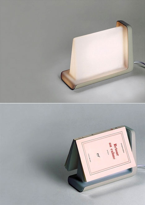
Reading lamp, designed by French designers Jun Yasumoto, Alban Le Henry, Olivier Pigasse and Vincent Vandenbrouck, is wonderfully simple: it's "a lamp that shuts off when you put a book on it, and that turns on when you take your book to read it."

via Core77

7.08.2009

If your typeface was a prostitute

The (first-ever) sex and art issue of Wallpaper* is very nice and very naughty. The focus on design and art issues related to sex is surprising and inventive. Check out this feature from the magazine's website/store: Typographic Tart Cards !

Tart cards are the means by which many London prostitutes advertise their services. Step into almost any central London phone box and you can contemplate up to 80 cards inviting you to be tied, teased, spanked or massaged.

Even if a police crackdown, the internet and the increasing use of mobile phones suggest their days are numbered, tart cards are still so pervasive they are now regarded as items of accidental art and have something of a cult following. Once on the periphery of design, tart cards have influenced the work of many mainstream artists such as Royal Academician Tom Phillips and Sex Pistols designer Ray and Nils Stevenson.

In conjunction with St Bride Library and Type, we asked designers – from students to superstars – to find the tart hiding in every type and create their own graphic numbers. Along with a selection in the magazine, all 450 cards can be viewed here. They will also be on display at KK Outlet, London from 22nd to 29th June. Click here for the invite to the show.
In among this plethora of brilliant, witty graphic designs we would like to highlight the serious issue that lies at the heart of the world of tart cards – the plight of trafficked women in the sex industry. It is a subject touched eloquently on by Mike Dempsey of Studio Dempsey, who is a volunteer at the Helen Bamber Foundation which helps rebuild lives broken by human rights violations. While our exhibition is an ode to the graphic qualities of the tart card phenomena, Dempsey's design is a pertinent reminder of the sinister world that lies beneath every card.

Thanks Wallpaper*

5.21.2009

Not for Kids


The Guggenheim and Fallingwater in LEGO. Press Release and Product Page (it's such a tease!).

5.20.2009

Hilarious Graphics, Pointless Story


[click photo to read]

4.22.2009

A New Look for Granville Island Brewery

Granville Island Brewery and Cap College* got some nice international attention today. The Dieline.com ("the world's #1 package design website") featured the work of Felicia Hildebrandt, a 2009 grad of the IDEA program at Cap.

What do you think? Should the brewery adopt Felicia's designs?


* Thanks to Gordon Campbell, it's officially Capilano University but Premier Campbell can take his insta-universities and shove it.

BC Votes. May 12.

4.21.2009

Nutty

WIRED is one of the most exciting print magazines out there*
The design is consistently creative and engaging. But what really gets me to buy their magazines is that they are fantastical at packaging their issues.

For instance, take the May issue of the magazine, guest edited by J.J. Abrams. The entire magazine is devoted to the theme mystery; running throughout the pages is a series of puzzles which direct the reader to a secret website.

The NYT reports that Steven Bevacqua, a postproduction supervisor for the TV series Life, was the first reader to solve the puzzle, earning him a prize from Abrams. But other readers that can crack the codes (let alone figure out which ones are the puzzles... some are found in illustrations and photos: "you might ask why are there so many typographical errors in the text of Poe’s short story “The Purloined Letter” that appears on the screen of the Amazon Kindle on Page 46.") might win big as well.

So take that, Internet. Print is alive (and sort of) well.
“Blog posts can effectively summarize a story and give you the takeaway idea,” said Thomas Goetz, the deputy editor of Wired. But print publications, he said, are still better suited to conveying “the nuance and effort of understanding the complexity of an idea and why it matters — what the riddles and wrinkles are within an idea.”
via NYT, "A Magazine With a Puzzle Buried Inside"

* and though I'd like to say that it's ironic, WIRED is about more than the web, it's also about technology in the real world, so it's doesn't really qualify as being completely contrary

Here's another puzzle for you, albeit it works online (click to enlarge):

4.10.2009

Accidents Happen (sorry, little guy)


"The Accident" (2008) -- Jeremy Hatch is a ceramicist and sculptor who holds a BFA from Emily Carr Institute and an MFA at the New York State College of Ceramics at Alfred University. He has attended residencies and exhibited his work throughout Canada and the United States. Jeremy currently employs a ceramic process of slip-casting porcelain to produce large unglazed sculptural installations. He has expanded his material investigations to incorporate rubber, plastic and fiberglass into his ceramic work. Hatch was the recipient of British Columbia’s 2005 Visual Arts Development Awards.

Take a look at Canadian Design past and present at The Canadian Design Resource

4.08.2009

Ol' Fashioned Innovation at Esquire

Take a look at the May 2009 cover of Esquire US


via MagCulture

3.06.2009

It's better in French


And here are a few more NSFW covers I love via The Selby. Thanks, Ryan... those workspaces were inspiring.

P.S. In related design problem solving, here's a similar use of typography on the cover of Wallpaper.

3.04.2009

A little bit of literary eye candy: the Book Cover Archive (like Sleevage but for books)

Some hand-picked favourites:

3.03.2009

If it ain't broke, don't fix it!

According to Fashion Week Daily, Interview magazine is getting a whole new look starting May of this year. Remember the fantastic relaunch of the magazine in September 2008? You know how great it looks now? Yeah, leave it alone!

2.28.2009

The Medium is ...

Regarding McLuhan's most famous title...

"[...]the title was a mistake. When the book came back from the typesetter, it had on the cover "Massage" as it still does. The title should have read The Medium is the Message but the typesetter had made an error. When Marshall McLuhan saw the typo he exclaimed, "Leave it alone! It's great, and right on target!" Now there are four possible readings for the last word of the title, all of them accurate: "Message" and "Mess Age", "Massage" and "Mass Age"."

-- Eric McLuhan in Phil Baines. Penguin by Design, A Cover Story 1935-2005. Penguin Books.Pg 144

Source: Wikipedia